


What is Rich Black and When to Use It
We’ve all heard designers talk about rich black but what is it and why should we care? Well it can have a drastic effect on the look of your print and digital design and, if you’re not careful, even the production price.
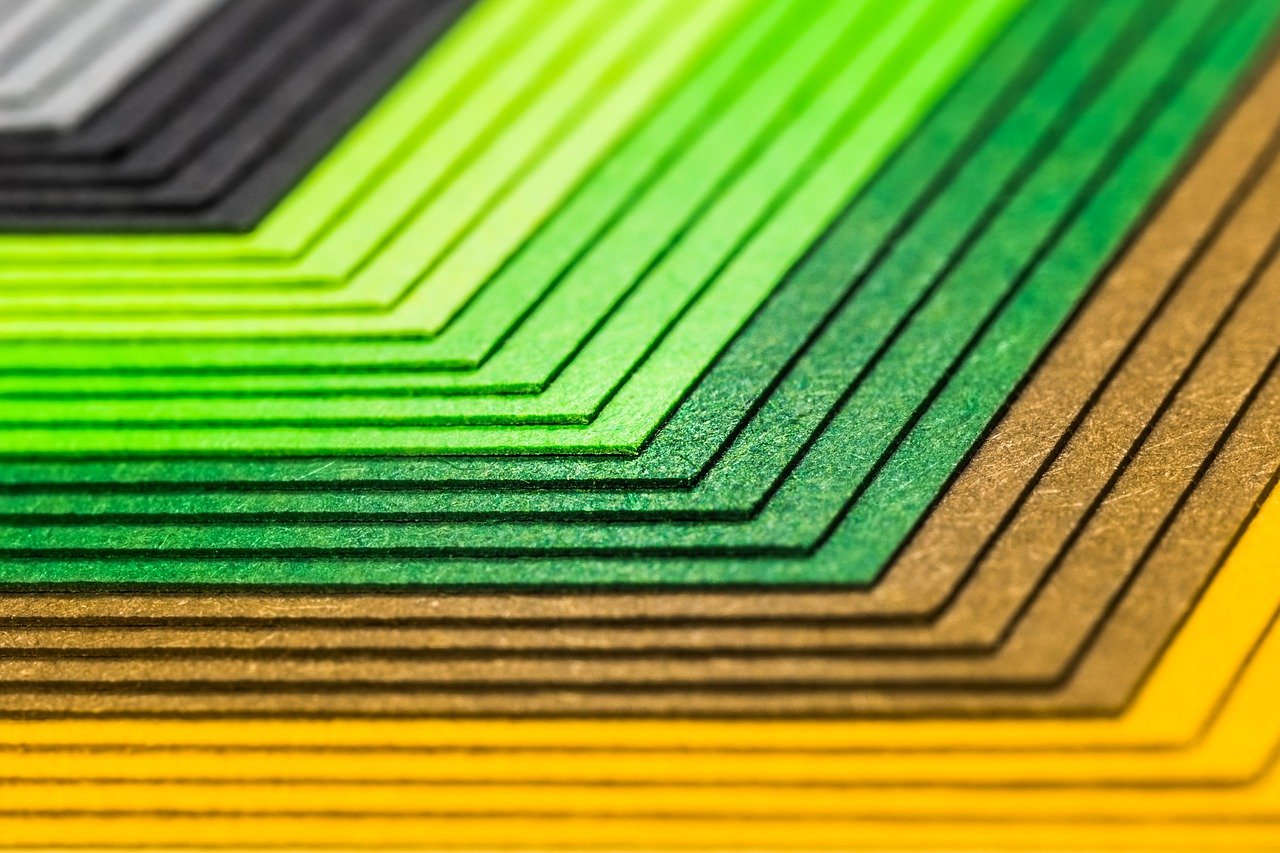
To understand rich black we have to understand what goes on in process printing, for those of you who know this, bear with me… When your product goes through the pre-press department it is separated into process colors (unless you have spot colors or are printing in just black and white). All the images and colors are broken down to Cyan, Magenta, Yellow and Black (CMYKi).
As each color is laid down over the previous it creates the images and colors you see in your design. So what does this have to do with rich black? Well it’s quite simple really. A standard black is made up of just the black ink, the K value in CMYK, and nothing else. Rich black has a little of the Cyan, Magenta and Yellow in it as well. This creates a deeper, richer black.
This is by no means a new invention. Take a look at your design or pagination software, is there a default swatch called Registration? Open it up and take a look at the CMYK values, in InDesign it’s 100%, 100%, 100%, 100%.
Play with CMYK values and see what you like best. Different ink levels will create hot or cold blacks. However, in order to see the difference accurately you will have to print the piece, a four color desktop printer should suffice for testing purposes. Since digital screens display in RGBi, differences in CMYK values don’t always display properly.
When designing a print piece you should always work in a CMYK document. However, sometimes we forget and end up having to switch an RGB document to CMYK. Watch your blacks when you convert. RGB black is not always 100% K. Depending on the CMYK profile your design software uses to convert the document your blacks could end up anywhere on the rich black spectrum.
When and Why to Use Rich Black
So what? Why does it matter? Lets take a look at the implications of designing with rich black.
Depth
There are definite advantages to using rich black. At 100% K, the black looks dull and flat. With a rich black there is a much deeper, elegant quality to the black. Imagine your brochure with rich black elements stacked next to your competitor’s who has not used rich black, whose is going to pop out to the customer more? Whose looks more elegant? Little things like using rich black can give your print products an edge over the competition. The rectangle on the right is half flat black, half rich black, click on it to open in a new window and print it off on any color printer to see the difference. Use the eyedropper tool in Photoshop to check the values.
Cost
If you have a product that is black and white or being run with just spot colors, it doesn’t make sense to include rich black. Black and white and spot color only designs are not run as process to save you money and ensure the colors you requested are the colors you get. Think about it, why pay for cyan, magenta, yellow and black on top of your spot colors or if you only have a black and white document? However, if you are printing four-color process anyway, there is no added cost to using rich blacks.
Trapping and Registration
Using rich black for text over images helps with trapping and registration problems. If the plates are slightly misaligned there can be a halo of white or color around the type. However, running rich black can help eliminate this problem.
When Not to Use Rich Black
Spot Colors
If you’re printing only spot colors instead of 4-color process it doesn’t make sense to use rich black. Think about it, why pay for cyan, magenta, yellow and black to be included if the only reason is for a rich black?
Black and White
It’s t he same idea as using rich black with spot colors. Now what would have been run with just one color has to be run with four, increasing the cost of printing. Essentially you’re paying for 4-color process and getting a black and white piece.
Fine Print
Do not use rich black on long segments of small text. The area of ink coverage is not large enough to make a noticeable difference and it can make registering the plates difficult, increasing the man-hours you’ll be charged. However, when printing text over an image, use rich black.
Paper Stock
In rare cases, rich black should not be used on very low quality paper, such as newsprint, because the paper can’t handle the large volume of ink. This can cause the sheets to stick together or even tear in the printing process. However, this is rarely a problem.
Experiment
Remember to experiment. There are some examples you can print and view to see the difference having more or less of each separation makes. If you want a cool black, increase the Cyan value. If you want a warm black, increase the Yellow and Magenta.
As always, if you’re unsure of what to do with rich black, just ask, we always love hearing from you!
