

Introduction and the Color Wheel
Color can be a tricky design element for beginning designers to master. In fact, the process of picking colors to use even has its jaded overtones. Most design instructors will tell you to pick your color scheme based on the emotions the palette invokes and to never pick a color because you like the way it looks.
Well, why shouldn’t you pick a color because you like the way it looks? Now, we’re not saying you should turn your logo blue if it was red just because you like the way it looks but if you like a color’s looks, isn’t it probably because of an emotional response you’re having to it? It is important to make sure your response is similar to the response of those you’re communicating with. All other restrictions aside, there is no problem picking a color because you like the way it looks.
Whether you pick your colors because you like the way they look or for some deeper, research based reason, or maybe because it’s what your boss told you to use, it is important to understand some of the basic color interactions. This leads us to the color wheel. This circle of colors is plastered all over art classrooms from elementary through college.
No matter how many steps there are around the wheel, all color wheels are based on a simple set of principles. Let’s take a trip back to elementary art class.
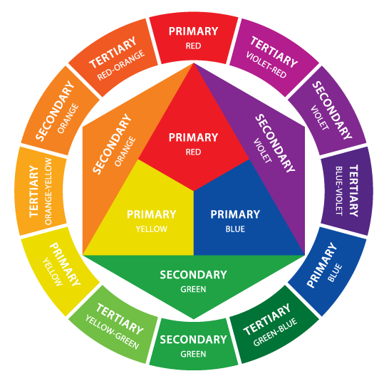
Primary Colors
Red, yellow and blue. These 3 colors are the base for every other color on the color wheel. This is why they’re called “primary.” When you mix two primary colors together, you get a secondary color.
Primary colors are the most vivid colors available to a designer when placed next to each other; they convey a sense of urgency. Have you ever noticed that most fast-food restaurants use red, blue or yellow as the base for their color scheme? This is no mistake, when you’re hungry on the go, you need food fast and there are no faster colors to convey this than primary colors!
Secondary Colors
Orange, green and purple, these are the secondary colors, the result of mixing any two primary colors. They’re located between the primary colors on the color wheel.
Secondary colors are more visually interesting than primary colors. However, using secondary colors in a design decreases its sense of urgency.
Tertiary Colors
Think of these as everything else. Tertiary colors are the result of mixing one primary and one secondary color. Depending on the ratio with which these are mixed there are endless potential combinations, these are the colors that fill in the color wheel to create the flowing, rainbow look.
There are many other terms used to refer to the various other aspects of color. These other groupings add another layer of complexity but provide a deeper understanding of color theory and can help you understand when conversing with designers or clients.

Warm Colors – Red, yellow and orange cover the spectrum of warm colors. These colors are considered warm because they remind us of things in nature that are warm, like the sun or fire.
Cool Colors – Blue, green and purple (violet) are considered cool colors. These colors are considered cool because, again, they remind of us thing in nature that are cool, like water or grass.
Neutrals – Gray, and brown are neutral colors. These aren’t on most color wheels but they’re considered neutral because they don’t contrast with many colors. Like many neutral things in life, these are dull and uneventful colors.
Other Terms to Know
Complementary Colors are located directly across from each other on the color wheel. Red and green, blue and orange, purple and yellow, etc. These colors rarely look good together because of their high contrast and vibrancy.
Analogous Colors are located right next to each other on the color wheel. Red and orange, blue and green, etc. Analogous colors match very well but create almost no contrast. They’re good for very serene feeling designs and artwork where you want viewers to feel comfortable and relaxed.
Value usually refers to the amount of black in a color: the more black a color has, the darker its value.
Brightness is the opposite of value. Brightness is the measure of the amount of white in a color: the more white the brighter the color.
Saturation refers to the amount of a color used. When a color is fully saturated, it is very vibrant. When a color is “desaturated,” a large amount of the color has been removed. Desaturated colors tend to be close to being neutral because there is so much gray in them.
QuickStart Color Guide
If you’re just starting out, this information may be a little overwhelming. At its core, the use of color is driven by the emotion it induces. So here’s a quick list about the feelings or meanings commonly associated with the colors we disused above. Keep in mind; a lot of the emotion and meaning behind colors is culturally specific. This quick guide will help you with American based interpretations.
Red: Passion, Love, Anger
Orange: Energy, Happiness, Vitality
Yellow: Happiness, Hope, Deceit
Green: New Beginnings, Abundance, Nature
Blue: Calm, Responsible, Sadness
Purple: Creativity, Royalty, Wealth
Black: Mystery, Elegance, Evil
Gray: Moody, Conservative, Formality
White: Purity, Cleanliness, Virtue
Brown: Nature, Wholesomeness, Dependability
Tan or Beige: Conservative, Piety, Dull
Cream or Ivory: Calm, Elegant, Purity
Other Resources**
From time to time we can all use a hand. Check out some of these other sites, they’re all full of useful information about color theory and creating color schemes.
www.colourlovers.com — COLOURlovers is a creative community where people from around the world create and share colors, palettes and patterns, discuss the latest trends and explore colorful articles.
kuler.adobe.com — Adobe® Kuler™ is a web-hosted application for generating and sharing color themes. Kuler has a built in panel in many of the Adobe® Creative Suite applications.
www.colorschemedesigner.com – Color Scheme Designer is a straightforward color scheme generator. It is a simple web-based tool great for creating palettes for web design.
www.colorcombos.com — Color Combos is another palette generator and library where you can browse thousands of color combinations. However, Color Combos features another tool that can prove immensely useful. The “Grab Website Colors” engine allows you to input any URL and it will tell you what the site’s color scheme is. This is a great way to learn from the designs of others and follow our inspirations.
**These resources are third party design tools not associated with Pengad Inc. in any way.
